Originally published on Grafik.net here.
As many a designer will tell you, the most fruitful and fulfilling projects are often borne out of close collaboration, through which the definitions between traditional client and designer roles are blurred. Work with contemporary artists can offer a prime opportunity for this kind of approach to flourish—it’s no accident that some of the more innovative, experimental, and engaging examples of book design in recent decades have been the product of artist-designer partnerships. For artists and designers alike, the form of the book offers a defined set of parameters in which to articulate their practice, creating a new work in the process that blurs the line between their two disciplines.

James Langdon is a designer particularly well-versed in the nuances of this collaborative approach—he’s worked extensively on contemporary art-related projects over the course of his career so far, forging ongoing working relationships with artists, publishers and institutions. The form of the book holds a certain fascination for Langdon, particularly in the context of art practice. He co-curated an exhibition at Eastside Projects in 2010, Book Show, which focused on artists’ explorations of the book, and has worked on many such explorations himself with artists including Ruth Clacton, Simon & Tom Bloor, Dora García, and Slavs and Tartars. His latest project is bau bau, a monograph of the work of the artist Céline Condorelli, with whom Langdon has worked for the past decade. We caught up with him shortly after the publication’s launch, to discover how this collaborative relationship developed, and to explore the visual and material devices he employed to present Condorelli’s practice in book form.

“I consider Céline among a very small group of collaborators whose practice has become intimately connected with my own,” says Langdon. “Our working relationship is complicated in a very positive sense—Céline has commissioned me to make images, artworks, and publications; and I have commissioned her to write and make works for a number of my own projects. I very much appreciate the way this relationship extends the vocabularies of both practices. Céline's aesthetics and knowledge are a resource that I draw on, and I make my own research and technical knowledge available to her in the same way.”
Langdon and Condorelli first met in 2007 through their mutual friend and collaborator Gavin Wade, the founder of Eastside Projects. The trio’s first project together was a book documenting an exhibition project, Support Structure, which Wade and Condorelli had been working on together since 2000. It was a pivotal early project for Langdon. “Support Structures was the first substantial book that I had designed—certainly the first book of that extent and complexity,” he reflects. “I was working alone in the studio, handling every aspect of the design, typography and some very complicated preparation of images. I think it took Céline and I a few years to process that book and what it meant for us, and our collaboration has grown gradually since then.”

When the opportunity arose for Condorelli to create a monograph of her work, she enlisted Langdon once again to work with her on its design. Over the course of two years, the pair developed a design approach for the book that went beyond conventional visual depictions and installation shots of artworks. “Céline and I are drawn to design processes that make visual, procedural or material analogies with the work being represented,” he says, “and within the constraints of resources available, we devised different treatments for each series of works.”

The resulting book incorporates essays, a conversation between the artist and Maria Lind, documentation of Condorelli’s exhibitions, depictions of different artworks and their component parts, reference materials, and an inventory of her works. “In the contents list we call the main visual part of the book an 'exhibition', signalling an intention to be as direct and primary as possible,” Langdon explains. “For a contemporary art monograph, these pages have relatively few photographs of gallery exhibitions. The 'installation view' as a genre of photograph that documents the placement of artworks in a space can be too ambient, or 'scenic' in the context of a book, which of course is itself a very specific spatial construction. The best parts of our 'exhibition' are those that unpack the elements of each work and re-visualise them to be seen on a series of page openings. A number of the works are sculptures that also function as display devices, and in those cases we liked the idea of reproducing both the characteristics of the objects and what they were used to show.”

Texts throughout the book are presented in both English and Italian, and are extensively illustrated, posing a design challenge that Langdon overcame through a meticulously tailored approach to layout. “I treated each paragraph as a discrete element on the page; the type face, size and spacing are consistent throughout, but the column dimensions are completely various,” he says. “Each paragraph is sized according to the flow of words that it contains and the supporting illustrations that it requires.” Dealing with each paragraph and image in this way was a departure from the conventional approach to typesetting and layout that are often employed in the design of a book, as Langdon explains: “Instead of considering the flow of text into a single format, you have the possibility to make many more various decisions. It avoids some of the difficulties of sentences and paragraphs being split across pages or openings, and produces a graphic dynamic that I like.”

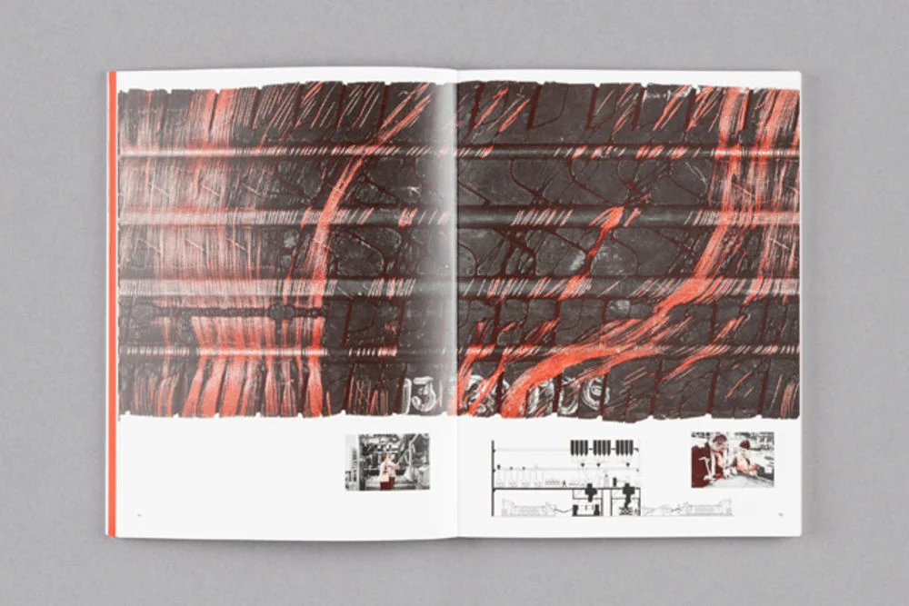
Condorelli’s fascination with the way in which design and print processes can reflect aspects of her work is also echoed in the approach to image reproduction throughout. For a section depicting works she created with tyre manufacturers in the Pirelli factory in Settimo Torinese, the images are reproduced in ink specially mixed to match the original installation. This colour scheme also references the cover of a paperback edition of Work and its Discontents by Daniel Bell, a book concerned with the struggle between man and machine in a materialistic society. Elsewhere, images of artworks are superimposed upon reproductions of fabrics from the original setting in which they were displayed.

The cover of bau bau depicts one of Condorelli’s curtain-based artworks, which acts as a neat visual metaphor for the function of the cover itself: simultaneously obscuring the book’s contents whilst inviting the reader to ‘peer behind the curtain’. Langdon and Condorelli had originally considered using a light, foil-like material for the cover, to match the material used in the work itself. For practical reasons they eventually turned to print for a different solution, adopting a characteristically emblematic approach. “We used a metallic ink, making a fifth colour separation in addition to cyan, magenta, yellow and black,” Langdon explains. “I took elements of each of those four colour separations from the original photograph and combined them in Photoshop. What you see printed in silver is a composite image that reflects the movement of the curtain in the breeze.”